Pokémon sprites, art evolve over the years
|
|
| This is an editorial by Argy. |
About the author
Argy is the former editor in chief of Bulbanews, a style editor at Bulbapedia, and an administrator at Bulbagarden forums. |

|
There is no need to modernize this outdated page. Please do not request an update. |
| This is an editorial by Argy. |
About the author
Argy is the former editor in chief of Bulbanews, a style editor at Bulbapedia, and an administrator at Bulbagarden forums. |
Just as Pokémon themselves evolve, so do their depictions in the Pokémon games and anime. The newest additions to the Pokémon library, Diamond and Pearl, are generally regarded by fans as having the most advanced graphics yet to be seen in a Pokémon handheld RPG.
Pikachu
Let us take for first example the most well-known of the Pokémon, Pikachu. The original Ken Sugimori artwork from Generation I is drastically different from the artist's rendering from Generation III.
-
 Generation I
 -
 Generation I redesign
 -
 Generation III


The Generation I Pikachu, in both versions, is fat with short arms and feet. In Generation III, Pikachu has been slimmed down and is not as round. The anime renditions mirror this. In addition, the Pikachu of the current anime design is a paler yellow.
-
 Pikachu from EP001 (1997)
 -
 Pikachu from Advanced Generation, the current design (2006)


Perhaps most striking are the sprites from the Pokémon handheld RPGs. The Pikachu of Pokémon Red, Green and Blue even had a different-colored abdomen from its later counterparts.
-
 Green and Red (Japanese) (Feb. 1996)
 -
 Blue (and Red in English) (Oct. 1996)
 -
 Yellow (Sept. 1998)
 -
 Gold (Nov. 1999)
 -
 Ruby and Sapphire (Nov. 2002)
 -
 Diamond and Pearl (Sept. 2006)
 -
 Platinum (Sept. 2008)
 -
 HeartGold and SoulSilver (Sept. 2009)


Even Sugimori's art from as far back as 1996 had Pikachu with a different-colored belly.
-
 An early watercolor

Other Pokémon received major makeovers in the transition from Game Boy to Game Boy Color to Game Boy Advance and finally to Nintendo DS.
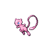
Mew
Mew, while seemingly a quite simple-looking Pokémon, has drastically changed from its introduction as the enigmatic 151st monster.
-
 Green and Red (Japanese) (Feb. 1996)
 -
 Blue (and Red in English) (Oct. 1996)
 -
 Yellow (Sept. 1998)
 -
 Gold (Nov. 1999)
 -
 Ruby and Sapphire (Nov. 2002)
 -
 FireRed and LeafGreen (Jan. 2004)
 -
 Diamond and Pearl (Sept. 2006)
 -
 HeartGold and SoulSilver (Sept. 2009)


Even today there is a difference between Mew as portrayed in the games and in the anime. Games Mew is clearly pink, while anime Mew is nearly white. Moreover, the original Sugimori art of Mew featured a dark pink tail and feet, something not present on later designs.
-
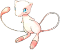 Generation I
 -
 Generation I redesign
 -
 Generation III
 -
 anime
anime


Charizard
Charizard has always looked more-or-less the same in both anime and games, however, the difference between the Green version sprite and that from Diamond and Pearl is striking.
-
 Green and Red (Japanese) (Feb. 1996)
 -
 Diamond and Pearl (Sept. 2006)


Arbok
In the case of Arbok, even its Generation III sprites vary. In Ruby, Sapphire and Emerald, its chest design features an open, red mouth and eyes with black pupils. However, in FireRed and LeafGreen, the mouth is completely black, and no pupils are present in the eyes. By comparison, the Arbok of Generation IV has the black mouth of pre-Ruby/Sapphire/Emerald games (although it should be noted that the original- and rare -Sugimori art of Arbok featured the open mouth).
Also of note is that in Generation I, Arbok's back sprite had black stripes that were never present in any other incarnation.
-
 Ruby and Sapphire (Nov. 2002)
 -
 FireRed and LeafGreen (Jan. 2004)
 -
 Diamond and Pearl (Sept. 2006)
 -
 HeartGold and SoulSilver (Sept. 2009)
 -
 Generation I back (Feb. 1996)
 -
 Generation IV back (Sept. 2006)


Moltres
Legendary bird Moltres is another example of drastic change in sprite design.
-
 Green and Red (Japan) (Feb. 1996)
 -
 Blue (and Red and English) (Oct. 1996)
 -
 Yellow (Sept. 1998)
 -
 Gold (Nov. 1999)
 -
 Ruby and Sapphire (Nov. 2002)
 -
 FireRed and LeafGreen (Jan. 2004)
 -
 Diamond and Pearl (Sept. 2006)
 -
 HeartGold and SoulSilver (Sept. 2009)


Many other Pokémon have evolved such over the course of the past decade, but these serve as some of the most prominent examples.
One must wonder how much more Pokémon designs will change in the inevitable Generation V. The transition from Generation III to Generation IV was, for the most part, not very striking, as Game Freak chose to stay with familiar pixel graphics as opposed to moving to more of a three-dimensional design as seen in most Nintendo DS games. There is only so far pixel graphics can be improved.
A discussion of the evolution of Pokémon sprites can be found in this Bulbagarden forums thread, and I encourage those interested to continue the conversation there.